
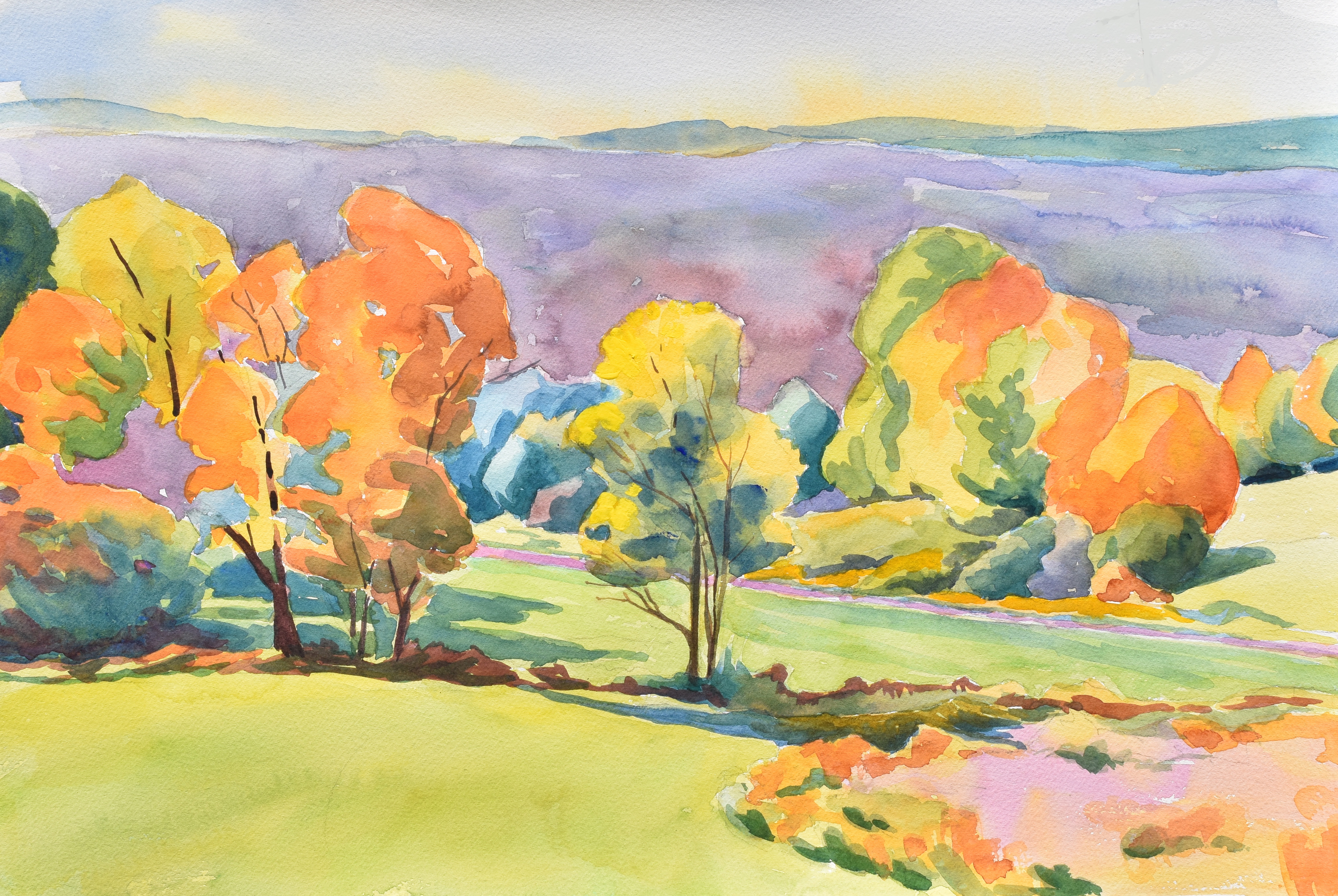
I usually think fall foliage is better captured as a photograph. A friend asked me about painting the fall colors so I gave it a try. The palette is primarily cobalt blue, lemon yellow, and permanent rose.
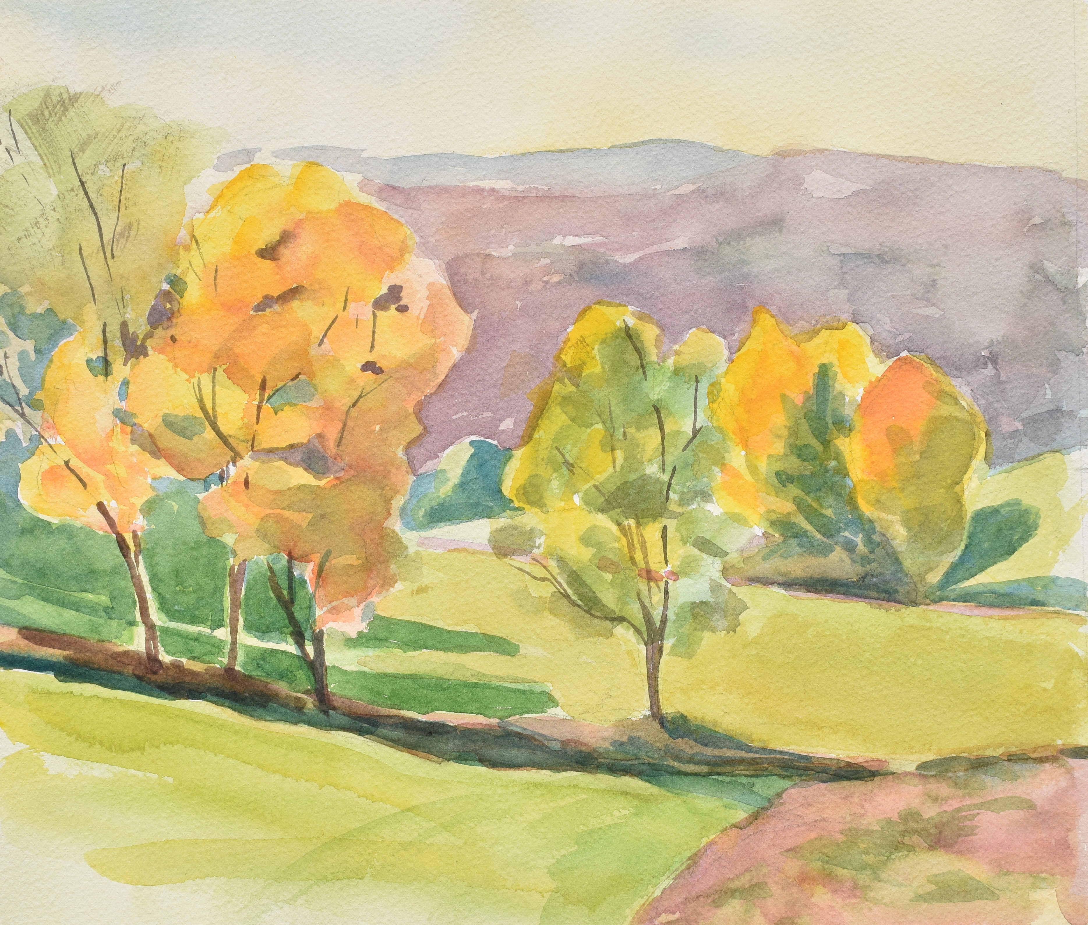

I usually think fall foliage is better captured as a photograph. A friend asked me about painting the fall colors so I gave it a try. The palette is primarily cobalt blue, lemon yellow, and permanent rose.
Vermont Watercolors
The thing I do instead of watching television
The Adventures of Jim & Jeneane
Just another WordPress.com weblog
Adventures in Watercolor Painting and Sketching, Watercolour Magazine, with Charlie O'Shields
Recreating Designer Looks from the 20s to the 70s
Travel and capsule wardrobe inspiration for the garment sewist.
Tales of a Stitcher
Sustainability and Belonging through Textiles
Frank Hobbs' blog for Painting courses at Ohio Wesleyan University
Inspiration for creative folks like you.
Life through the eyes of an autistic
The Art of Jeff Gold

Your fall colors are better than a photograph because they are your interpretation which always includes such reverence for the subject as well as your unique dash of spiritual intensity. I want to live in your artistic world.